Subsire
A subscription managing app
The Rundown
“What am I subscribed to?” “Am I still paying for this?”
These are common questions of the average person. Here at Subsire, we
understand this plight, and have devised a honed-in solution.
Helping users have more control over their subscriptions
How might Subsire allow users to better manage their subscriptions?
Having multiple subscriptions across many platforms is the norm of
today, Subsire users want to view all of their subsciptions in one
place, and be able to cancel from within the app. Subsire is also
looking to expand into the German Market
Problem
Subsire is now a one stop shop for all things subscription. Users
have the ability to view, edit, and cancel subscriptions all through the
app, with the ability to change language and currency during sign up
and within the app to cater to the German market.
Solution

Competitive Analysis
The first step to creating a worthwhile application is to see what is already on the market I
analyzed three different services that offer subscription tracking. Rocket Money, Bobby, and The
App store/Google Play Store.
Rocket Money was the most popular app for tracking
subscriptions. It gives you the options of viewing, editing
and cancelling; however Rocket Money is a finance app that
has a plethora of other uses. Making it overwhelming for
users who only want to track their subscriptions.
Bobby was another popular option. It gives you
complete editing power. That power comes from
manually entering every subscription. This still puts a
lot of load on the user to keep track of their
subscriptions, make sure the date and amount are
correct and update them on their own as they change.
Rocket Money

Bobby
Lastly, the built in app stores on phones were
analyzed. These update automatically and can notify
the user of renewals, the draw backs being lack of
editing power and only subscriptions purchased
through the app store are tracked.
Through competitive analysis I was able to discern what worked and what didn’t in similar services. Leaving a clear path on how to proceed in the creation of Subsire.

App Store
User Persona
After coming to a clear direction in what features will be in Subsire, It is important to decipher who
the audience will be in order to best present the features that will be available.
The demographic for Subsire users are mid 30 year olds, either with
families and busy lives or single and on the go.

Persona 1

Persona 2
User Journey Map
Now having research and user profile under my belt, it is time to map out how the user will
navigate through the app.

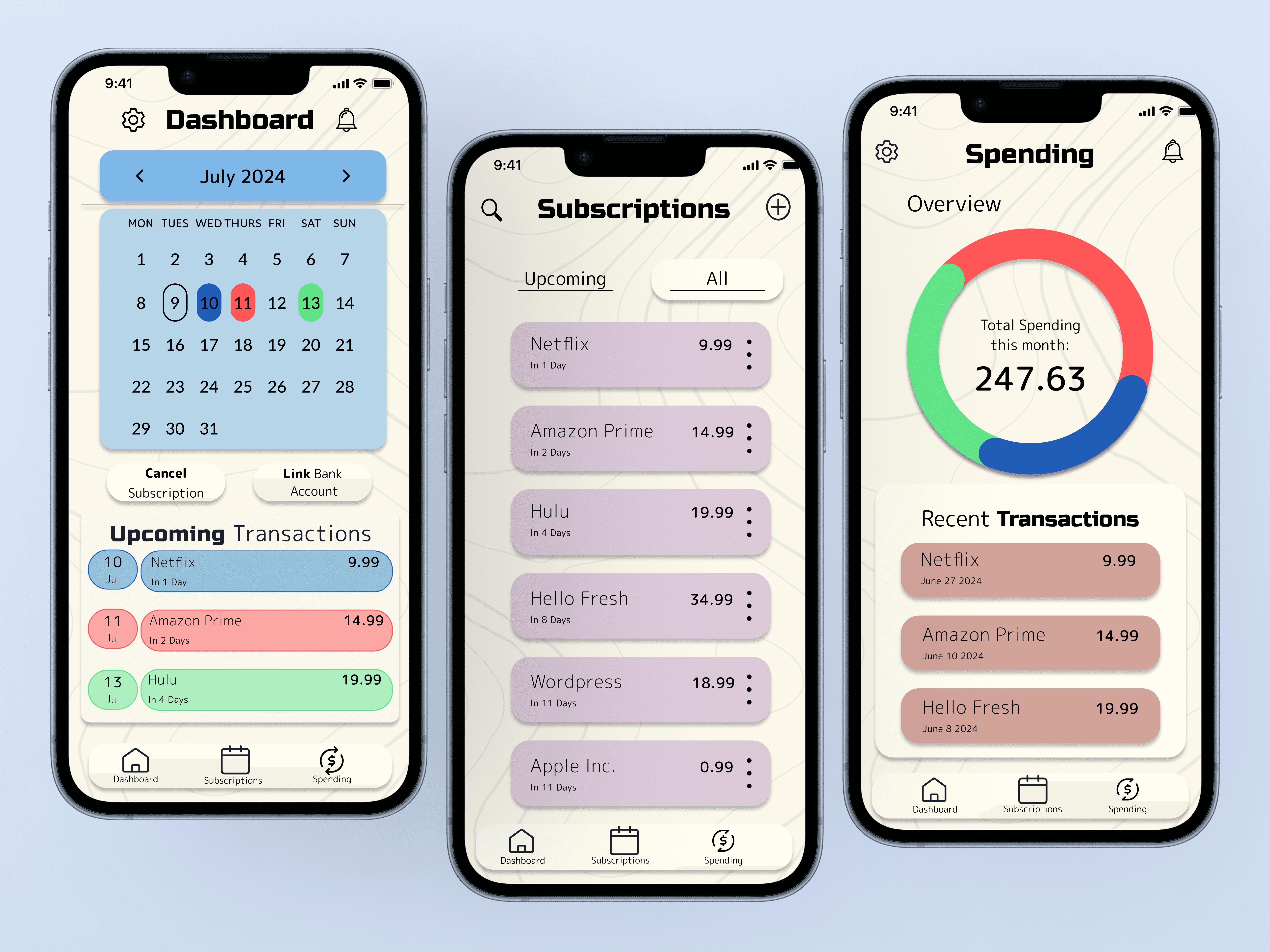
Spending Overiew Screen


Dashboard
Subscription Overview

User Journey Map
After completing onboarding, users have the option to link their bank account so that their subscriptions auto populate update. Then from the dashboard users will have the option to see their subscriptions in calendar view, with the other 2 pages being a comprehensive view
and a spending overview.
Lofi Wireframes
In the Lo-fidelity version of my frames I made sure to include multiple ways to
view what subscriptions are upcoming and how much those are.
User Testing
User testing was done in 2 rounds, 5 participants each. The objectives included identifying potential usability issues, validate design decisions and gain feedback form real life users.
Are the fonts and color scheme reading as intended?
Do users get lost or confused by a user flow sequence?
Are users expecting a different route to complete an action than what is avaiable?
Design System

Design System

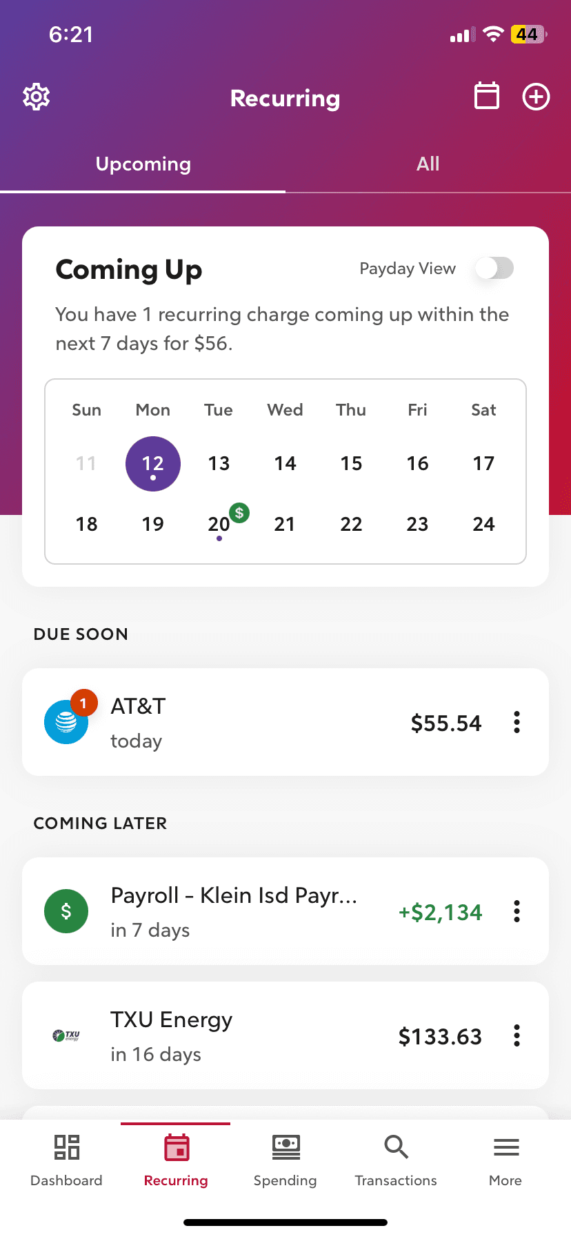
Sub detail wireframe
(before testing)
Sub detail hifidelity frame
(after testing)
Small adjustments to theoverall UI of the dashboard were completed. such as uniforming the roundness treatment and tkaing a bolder approach to the color matching to emphasize the coordination between the calendar and upcoming transactions.
“Im glad it’s not boring. Im
tired of seeing apps like this
in that shade of navy blue.
Like we get it, youre
trustworthy.”


Sub detail wireframe
(before testing)
Sub detail hifidelity frame
(after testing)
During the first round of testing, one of the tasks users were instructed to do was turn on autopay notifications for their subscriptions. 90% of users initially went to the detail screen, pictured above, to complete that aciton. Originally autopay was located in settings under notifications. In the hi fidelity version an additional route was added where users expected it to be.
" I love how welcoming the app is. It idoesnt feel intimiating at all, I'd actially use this!"
Conclusions + Considerations
While working on Subsire I was able to gain a deeper appreciation for testing. In conducting
usability tests, interviewees had questions and considerations that hadn’t ever crossed my
mind while working on the app. The naive thought that,
“Ive used a subscription app before, I
know what’s needed”
, was swiftly debunked. I am grateful for this exerience and to have
applicable experience towards the usefulness and possible insights from usability testing.
In future Iterations I look forward to continuing to streamline the process as well as add a
sort system for types of subscriptions to find redundancies.
Video of prototype
Homepage