Enhancing Youth Engagement and Effectiveness: A Financial Literacy :Landing Page Redesign
Role:
User Designer
Timeline:
4 Weeks
Sector:
Education
Design
Branding
Client:
Flip and Floss
The Problem
Flip and Floss Struggled With Attracting and Engaging Their
Intended Audience of 8-14 Year Olds

Colors dull and neffective, fails to
resonate with younger audiences
Call to action buttons not explicit about downloading mobile app
Design leaves has negative space issues, giving a less than professional appearance
Competitive Analysis
4 companies were researched for competitive analysis; focusing on general feel, UI, and company structure.


An assessment of the GreenLight website reveals
strengths in design, user engagement, and feature
promotion, while suggesting improvements in
transparency, navigation, and trust-building to
better serve its target audience.
MoneyTime’s website effectively targets young users
and their parents with a clear, engaging layout, demo
videos, and educational features but could benefit from
an expanded age range, a dedicated mobile app, and
improved interactivity.
Acorns’ website combines clean design, clear
CTAs, and educational resources to simplify
investing for beginners, with potential to boost
engagement through personalized content and
interactive features.
Cash App's website offers a dynamic, visually
engaging design with clear CTAs and a focus on
mobile app promotion, but its complexity, minimal
onboarding, and focus on existing users may hinder
accessibility for new users.
Solution
Optimizing Flip and Floss for Tweens: A Vibrant, User-Friendly Redesign to Boost Engagement and Drive App Downloads
To increase traffic and engagement among tween users, the Flip and Floss website homepage was redesigned with a streamlined layout, vibrant color palette, and a soft yet bold font style. Enhanced information hierarchy and intuitive navigation were prioritized to create a seamless and enjoyable user experience tailored to thisbaudience. The refreshed design not only simplifies the browsing process but also, strategically guides users toward the primary objective: downloading the Flip and Floss mobile app.
The Process
Sketches

Fun Grphics
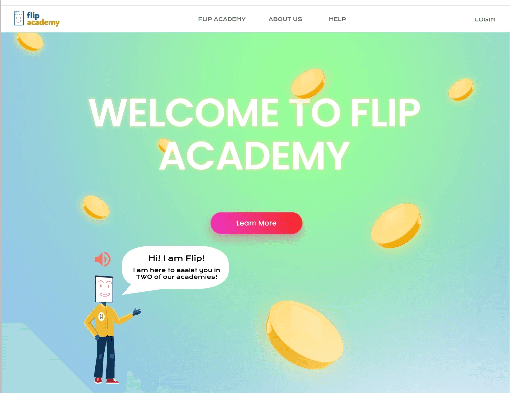
Kids engaged in activiteis that tie with Flip and Floss's feautres
Video loops for an exciting feel as wel as mutliple CTA buttons
Style Guide

In the style guide we created a more vibrant color palette, and found inspiration for graphics that incorporate the brands goals of reaching younger audiences.
Wireframes Hi-Fidelity
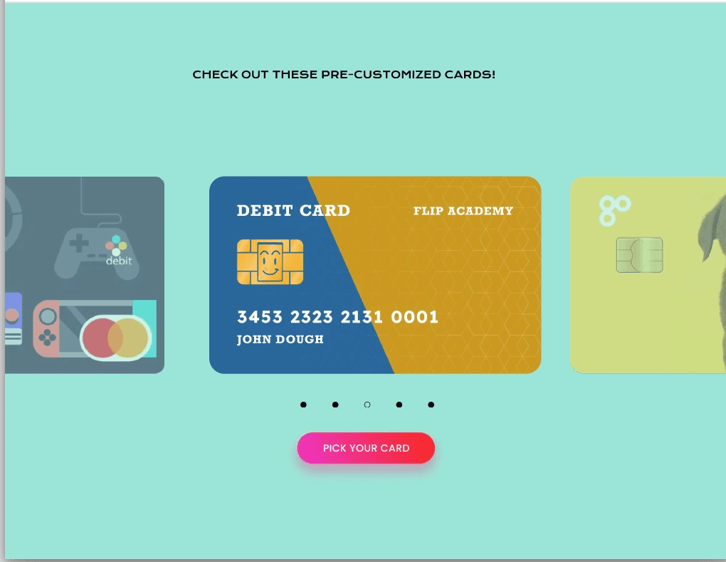
Vibrant and youthful UI, dynamic background as well as showcasing Flip and Floss's Mascot, Flip.
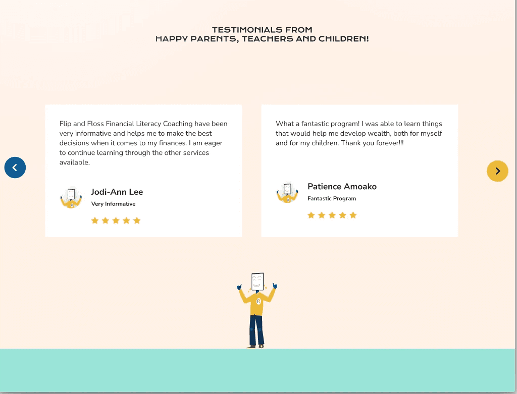
Including testimonials adds to the trusthworthiness of the site and can encourage users to download the app.
Clear CTA emphasizing the purpose of the website and how we want users to interact.
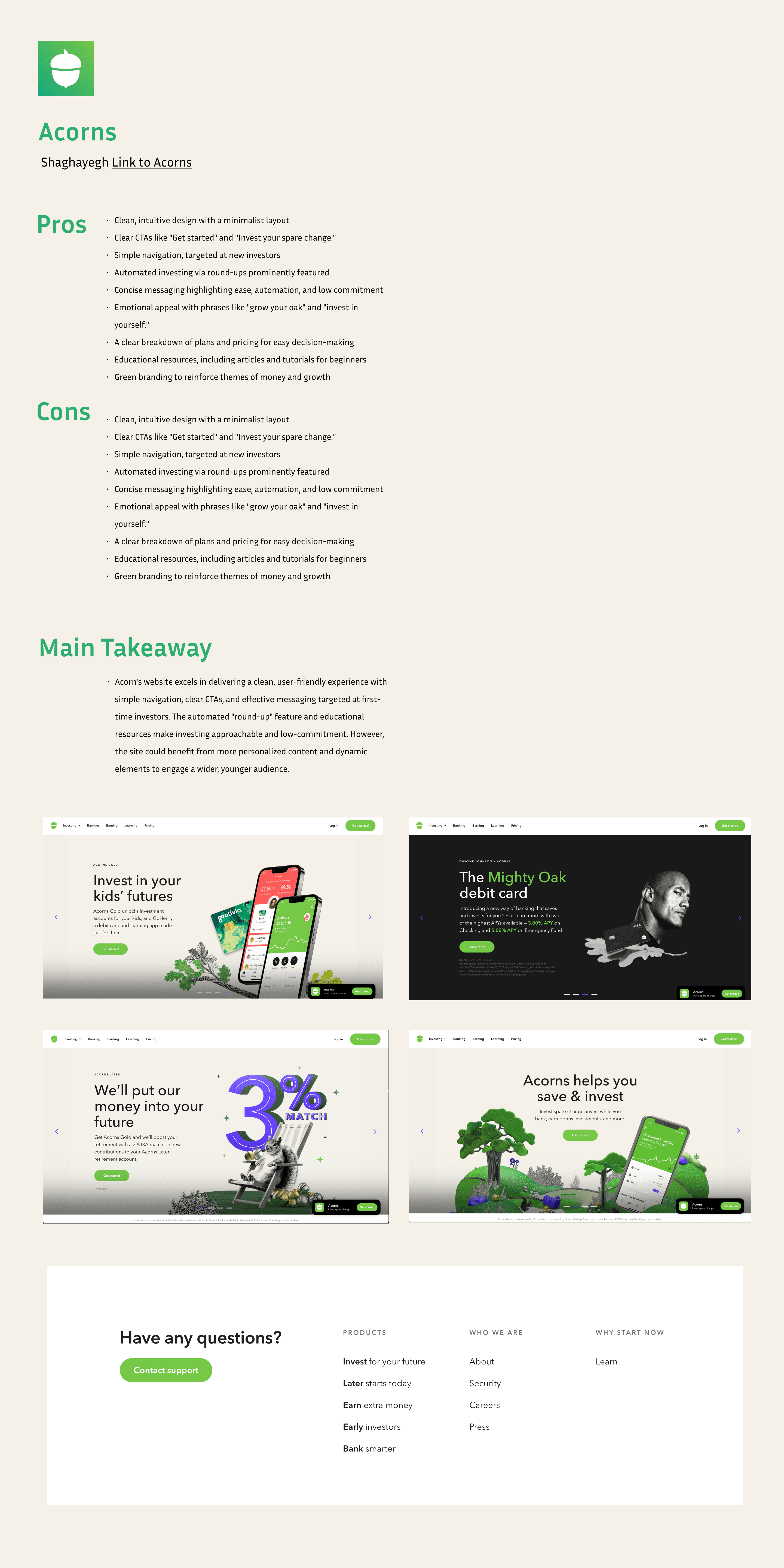
Outlining the customizability aspect of Flip and Floss to excite young users about the ways they can be creative.
Client Feedback
Flip and Floss stakeholders were impressed with the redesign, enjoying the bright and modern feel and clearer purpose. They are currently in the process of revamping their website following the themes presented in our mockups.
“This is amazing work for such a short timeline, our team would have
never gone in this direction, thank you for lending us a new
perspective”
-Andre Smith, Flip and Floss CEO
Takeaways
This was Flip and FLoss’s first time outsourcing to a UX design team. We taught them the importance of clear branding and purpose, showing them the importance of putting themselves in the user’s shoes to create a product that was not just pleasing to the business but came across as intended to the users.
video of prototype
Next Case Study