In a time when reliable, relevant, and understandable financial education is in short supply, StayUP makes it easy to learn and use what you need without all the stress.
StayUP
Methods
User Research/Empathy Map/Testing/Visual Design/Prototyping
Tools
Figma, Miro, Pen & Paper
Role
User Researcher & Designer
Context:
Young adults struggle to understand important financial concepts needed to be successful in adulthood. In 2012 the state of Florida passed a law requiring high school students to take a financial literacy class before graduating due to over 60% of upperclassman failing a basic financial literacy test.
The Problem:
According to our research, available financial literacy resources are targeted towards individuals who already have a base knowledge, use too much financial jargon, and overall don't make young adults comfortable learning and growing from their present position.
Gameplan:
Create a financial literacy app targeting young adults, utilizing interactive elements, gamified learning, and laid back language to cater to as well as educate our audience.
Getting to know the user:
User Interviews
Utilizing Typeform, a screening survey was created to recruit potential users for interview about their experience finding and using other sources for their financial literacy information. Social media was leveraged to boost visibility. After users filled out the Typeform, candidates who were a good fit were selected to interview.
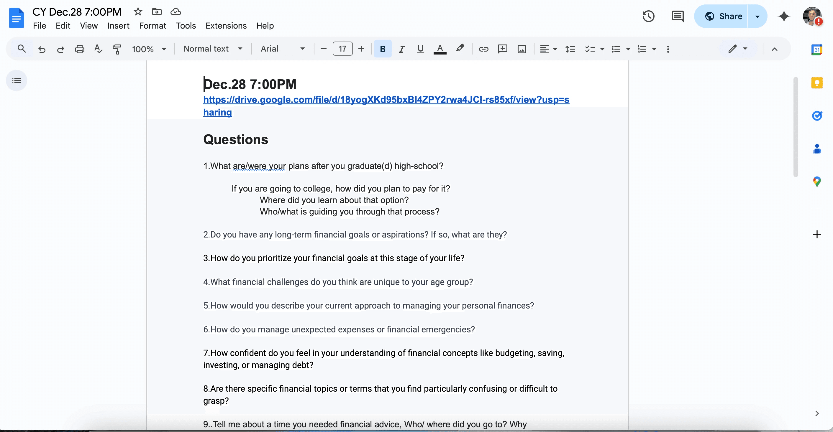
I then conducted problem discovery interviews with the users who passed the screening to learn about their experience finding and using available financial literacy information, identify potential opportunities, and learn pain-points.
Example Screening Questions:
How do you currently get your financial literacy information?
Rate your experience on the usefulness or applicability of the information you have found.
(1 being completely unusable, and 10 being exactly what you needed and can put it into play today.)
Insights:
Users are frustrated and overwhelmed with how to use newly discovered financial literacy information.
Transparency and readability are of upmost importance to users.
Empathy Map and Persona
Using the qualitative data collected from my User Interviews, I created an empathy map and then Persona to better visualize thoughts feelings and common themes of potential users.
Potential users are surrounded by opinions of others, demands of their job, school, and social lives. They regularly upkeep a "brave face"

Empathy Map made in Miro
User Persona made in Figma
Nick is fresh out of the
nest, ready to start managing
his own finances. Nick has his
plate full managing college, a
part-time job, and a social life.
He never has
*quite* enough time or energy
to learn how to plan his
finances and does not
understand half of what he
reads on the subject.


User Flow
I created a user flow to hone in on feature functionality before designing the interface. This contributes to maintain a smooth navigation experience, which is beneficial to users.
Onboarding flow was given extra attention to make sure that users understood the intention of the app.
Goal creation and tracking was an important factor to focus on as the most common deficit lies in the ability to stay on track for financial success.
We took an unconventional approach to educating on financial concepts, catering specifically to a gaming audience; infusing financial literacy concepts during gameplay.
Onto Design!
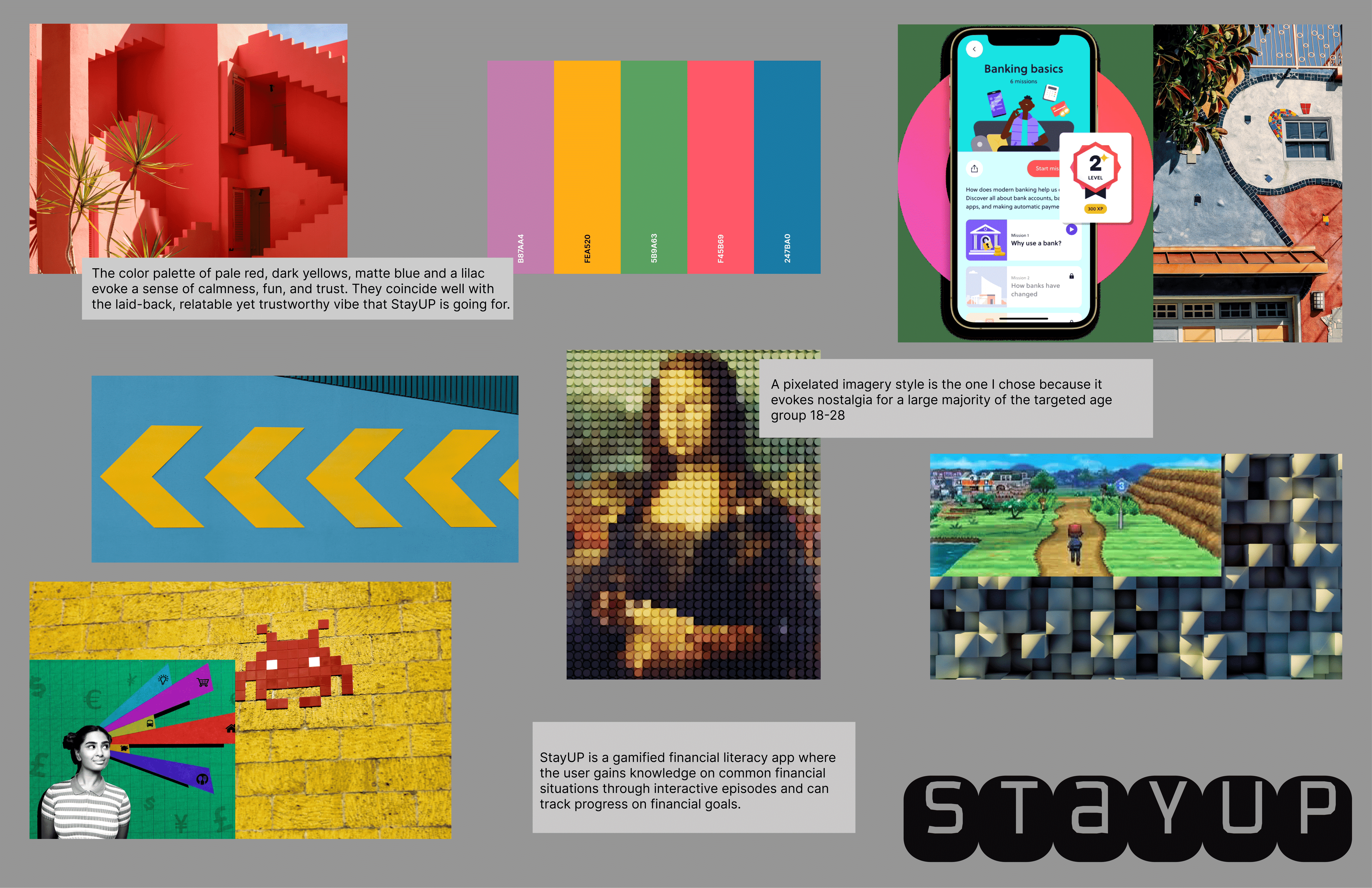
To guide and inspire the design direction and brand atmosphere, I created a moodboard as a first step.
Moodboard
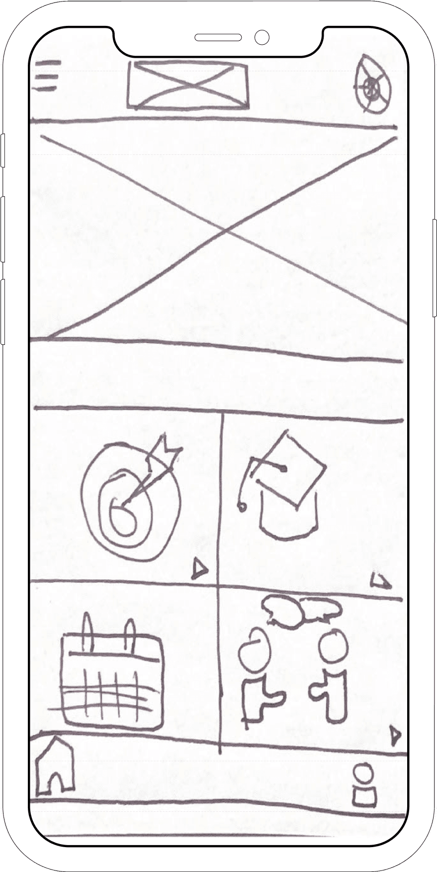
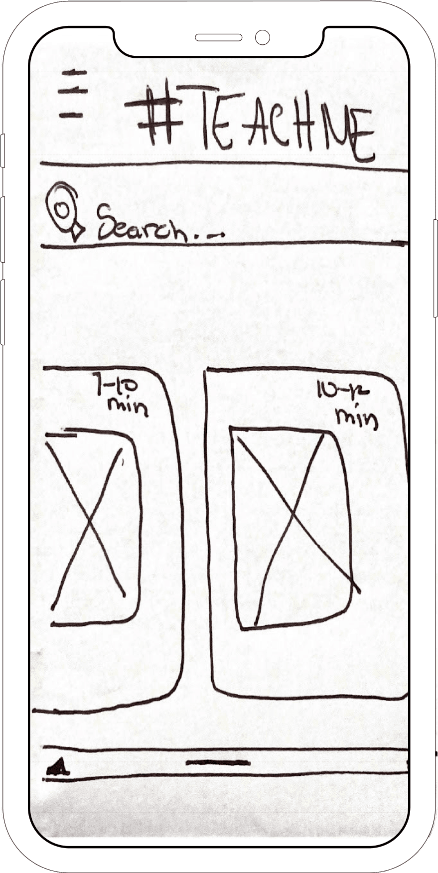
Sketch on paper/Figma Design
Next, I sketched out my designs on paper, then digitized them. Sketching is helpful in aiding me visualize the basic structure of the app and explore options relatively quickly. The Hi-Fi mockup has some minor adjustments to the original design as some feautures were thought of during the design process and others didnt land as intended.
User Flow in Miro
Moodboard designed in Figma

Login Screen
Learning Landing page
Home Screen
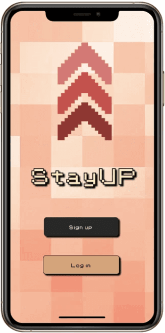


High Fidelity versions of the sketched designs, made in Figma
Usability Testing
Testing is crucial in ensuring that a design solves problems and provides users with an effective, efficient, and satisfying experience. By validating hypotheses and gathering real-life user perspectives, usability testing helps me achieve these goals.
Objectives
User testing, in this instance, had the goal of testing the funtionaility, resonation with the user, and intuitiveness of the design.
Testees
5 testees were recruited for each round of testing. According to Jakob Neilson's research (we allv know who he is) it takes only 5 partiicpants to detect 80 percent of usability problems

Glows
Grows
Participants enjoyed the pixelated font style , laid back language and found the app realtable in a new and refreshing way that other financial education apps lacked.
90% of participants had a ball with the gamified learning feature entiteled " Ricky's Adventures." Frequent feedback surrounded requests for the game to be linfer and that more episodes be available to play.
Many participants found difficulty navigating key parts of the app, such as moving to the next screen in Richy's Adventures and displayed confusion due to lack of feedback on completed actions.
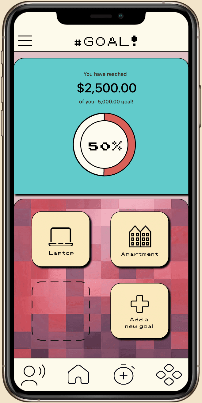
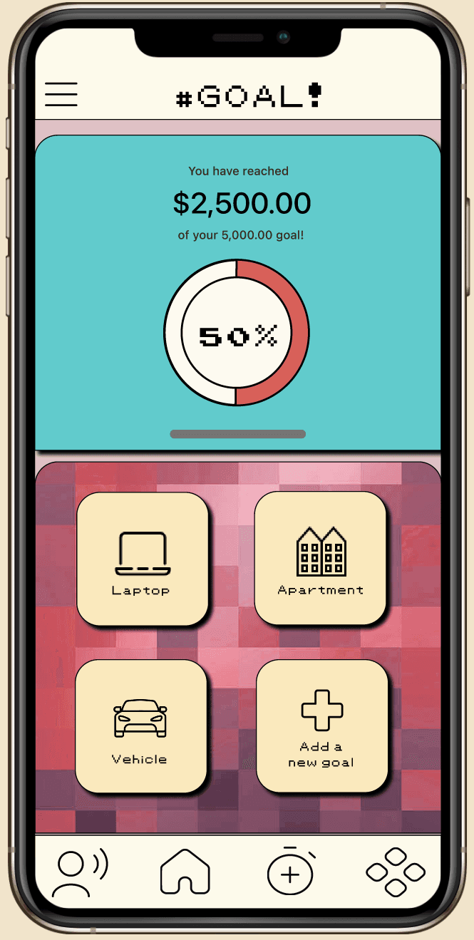
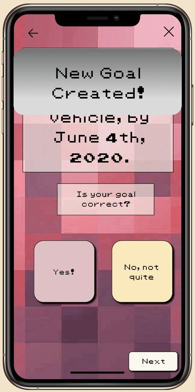
This was addressed by adding tutorial text at the beginning of flows (Figure 1), clarifying when an addition can be made (Figure 2), and adding completion notifications when setting a goal (figure 4).
Figure 1
Figure 2
Figure 3
Figure 4
*adding the dotted outline
space for a goal which then
moves to a filled image,
coupled with the
notification of a goal
created once “yes” is
tapped solidifed to the user
their actions have been
recognized.
Takeaways and Next Steps
During the weeks working on this project, many ideas were brainstormed to meet the goal of
creating a financial literacy app that catered to a younger audience. Research into similar apps,
finding what worked and what didn’t. Reviewing choose your own adventure style games to
find the format that fit for Richy’s Adventures. The most difficult part is sticking to
the scope of the project and having to curb other ideas.
In future iterations, I look forward to bringing to life other features that users have identified.
Such as a messaging service with financial advisors and additional episodes of Richy’s
Adventures. Completing this project end to end has been incredibly insightful and inspiring.
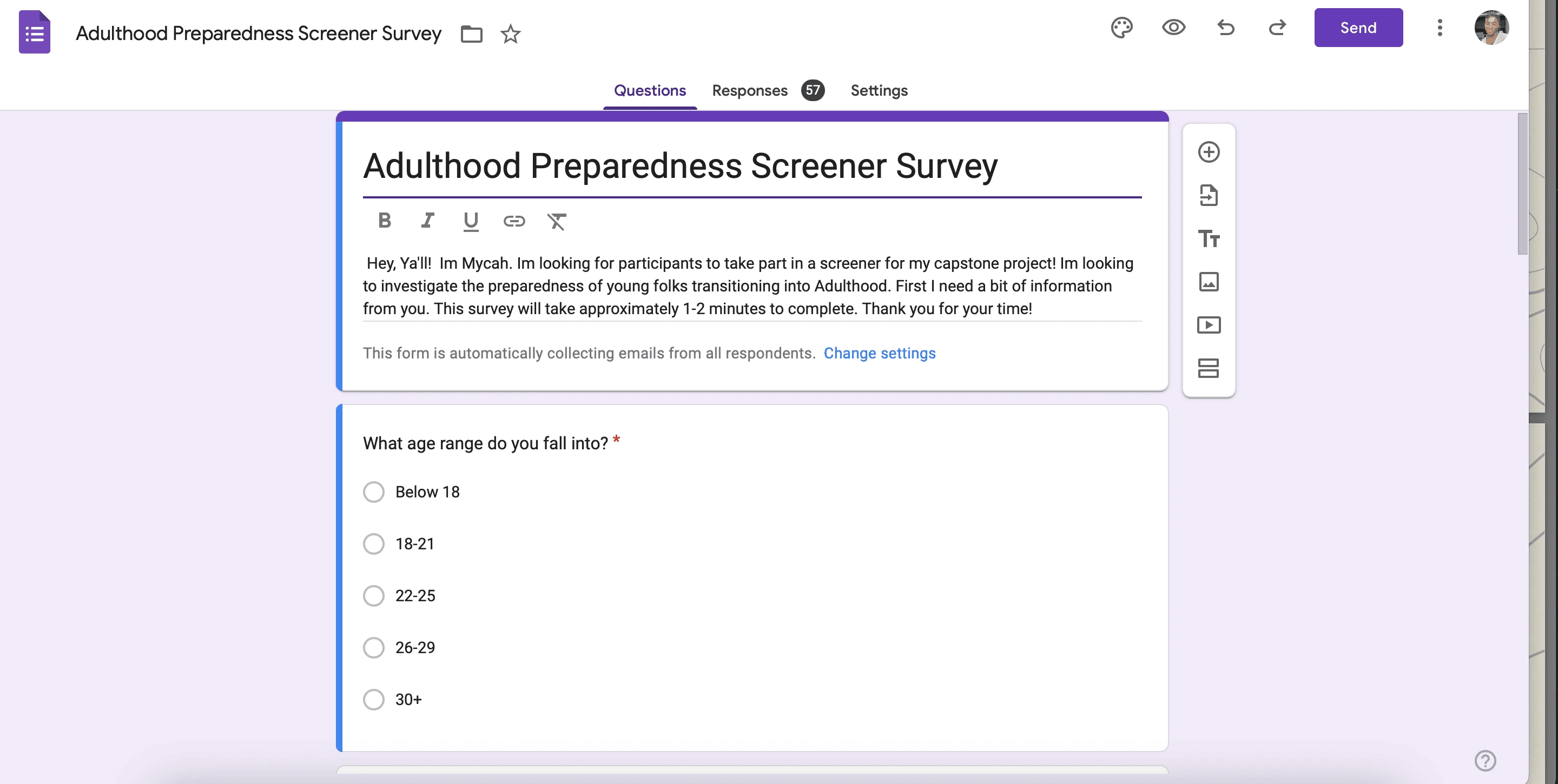
Screener survey
Interview Questions
Click here for the link to the google drive folder for full interveiw notes, questions, and survey!
video of prototype
Next Case Study